Weekly Report 12Nov2010
From RHESSI Wiki
Contents |
Pixon Albedo Imaging Results
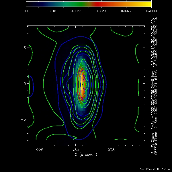
Using Eduard Kontar's simulated eventlist files, Pixon Images were created for a compact circular gaussian source with an albedo contribution near disk center, and near the limb. The following parameters were used for each image:
- Time: 2-Sep-2002 00:07:36 - 00:08:16
- Energy 24keV - 51keV
- Detectors 1 to 4
- Image Size: 64 by 64 pixels
- Pixel Size: .5 arcsec by .5 arcsec
In the images below the following convention was used:
- Background Image: The original data map supplied by Eduard Kontar
- Blue Contours: The Clean Image Contours
- White Contours: The Pixon Image Contours for the source near the disc center
- Green Contours: The Pixon Image Contours for the source near the limb
The Contours levels used were: 1%, 3%, 5%, 10%, 30%, 50%, 70%, and 90%.
The plots below each image show the flux of a pixel as a function of the distance from the centroid of the compact source. It is a modification of looking at the flux along a single line through the image. In this method every pixel is plotted so the entire image can be viewed. The following conventions were used in all radial profile plots:
- The values of the flux for the original data map were 'normalized' such that the peak value matches the peak value of the Pixon images
- The flux values for each pixel in the original data map are black points
- The flux values for each pixel in the Pixon image are red points
- The flux values for each pixel in the Clean image are green points
- The average value of the flux at each radial distance in the original data map is represented by the solid black line
- The average value of the flux at each radial distance for the Pixon image is represented by the purple line
- The average value of the flux at each radial distance for the Clean image is represented by the cyan line
Simulated source closer to disc center(X = 301 arcsec, Y= 0 arcsec)
The following images and plots of the flux are for the simulated source near the disc center.
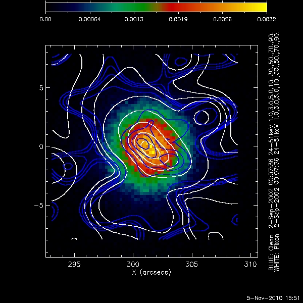
The following image is for the source near disc center with the lowest number of total counts, approximately 10^4.
Both imaging techniques produce an elliptical source around the centroid of the original data map. Neither reproduces the radially symmetric compact source. The Pixon image breaks up into multiple smaller sources at the centroid. The clean image produces an elliptical source with a major axis along the NE to SW direction. Neither method reproduces a symmetrical albedo contribution away from the centroid of the image. This may be due to the low number of counts away from the compact source. The albedo contribution may be on the order of the statistical noise in the image at that distance from the compact source.
The following plot shows the flux as a function of radial distance from the centroid of the source from an image with total counts of approximately 10^4.
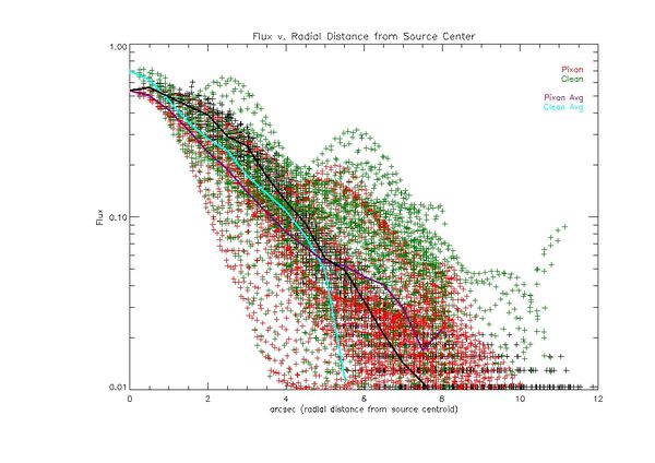
Looking at the plot above, the pixon image is more compact around the centroid of the source. The clean image contains multiple bumps, but they seem to be outliers that do not affect the overall average of the clean profile greatly. They look like artifacts. I don't think we can say that either method is imaging the albedo. The low overall count rate produces a spread of points at each radial distance which are not symmetrical around the average value. Future work needs to be done to determine which points are within the 66% and 99% confidence interval for each radial distance and which can be thrown out.
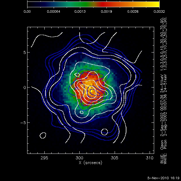
The following shows the clean and pixon images for an image with total counts of approximately 10^5.
The clean and pixon images both are approximately the size of the compact source. The 3% and 5% contours are both at the very edge of the source. However the 1% contour for clean is clearly defined while the same contour for pixon is in the statistical noise. At this number of total counts, clean seems to find structure down to the 1% level. Pixon has a higher flux much farther away from the compact source. This shows up more clearly in the radial profile plot below.
The following plot shows the flux as a function of radial distance form the centroid of the compact source for an image with approximately 10^5 total counts.
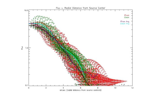
The most noticeable effect of adding counts to the image is the spread of the flux at any given radial distance is smaller. This is encouraging since we know the image is symmetric around the center of the compact source. There are also peaks which show up in the Pixon profile away from the center which may be evidence of the albedo, as they have an effect on the average of the profile at a given radial distance. The discouraging aspect is these peaks do not seem to be present in the average of the profile of the original data map. The pixon profile flux does not decrease to zero as the radial distance to the compact source increases. At the edges of the image it is higher than either the original data map or the clean image. This looks to be a persistent artifact of being at the edge of the image. It appears in every case shown in this report.
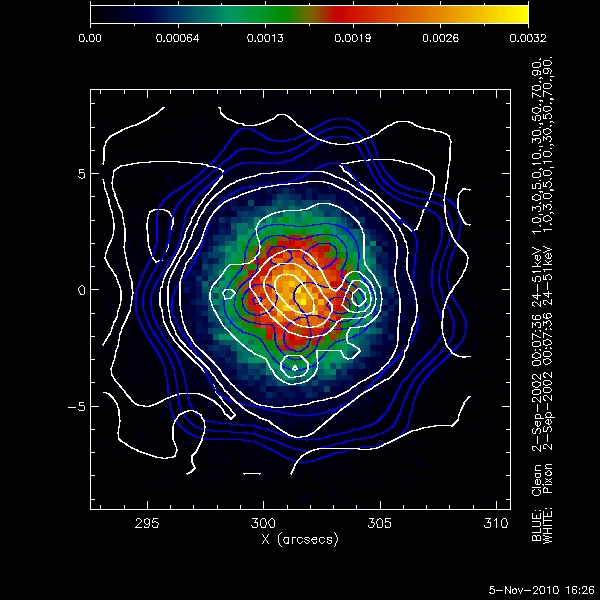
The following shows the clean and pixon contours for an image with approximately 10^6 total counts.
Once again in this case both imaging methods do a reasonable job of reproducing the compact source although neither is symmetric. Once again clean seems to do a better job of imaging the edges of the source, while pixon breaks up for the 3% and 1% contours. This should be not be due to a lack of counts. The image contains ~10^6 total counts.
The following plot shows the flux as a function for radial distance from the centroid of the compact source for an image with total counts of approximately 10^6.
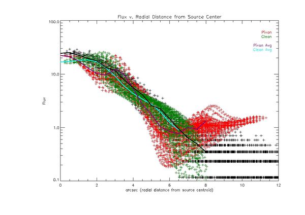
Once again, around the compact source the spread of points is tight for both the pixon and clean images. As we get farther away from the centroid, the clean image falls off like the original data map, the pixon image however levels off, with a much higher flux farther out from the centroid. There is a sharp rise in the pixon profile at approximately 2.5 arcsec from the center of source, but the shape of the profile changes so significantly it may be an artifact. Another interesting aspect of the pixon profile are the lowest values of the flux for each radial distance. Looking at these points from the center out to around 6 arcsec, they follow the characteristic shape of the model for the albedo, a sharply peaked gaussian lying atop a wider gaussian.
Simulated source near the limb (X = 930 arcsec, Y = 0 arcsec)
The following images and plots are for the simulated source near the limb at X = 930 arcsec and Y = 0 arcsec.
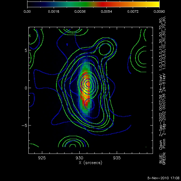
The plot below shows the clean and pixon contours for an image with approximately 10^4 total counts.
The clean contours do not display the foreshortening effect. They show a circular compact source along with a very noisy signal at the edges of source. The pixon contours also show a circular compact source. Neither algorithm can replicate the elliptical shape of the compact source due to foreshortening. However the contours at the edge of the pixon image do display a foreshortening toward the disc center.
The following plot shows the flux as a function for radial distance from the centroid of the compact source for an image with total counts of approximately 10^4.
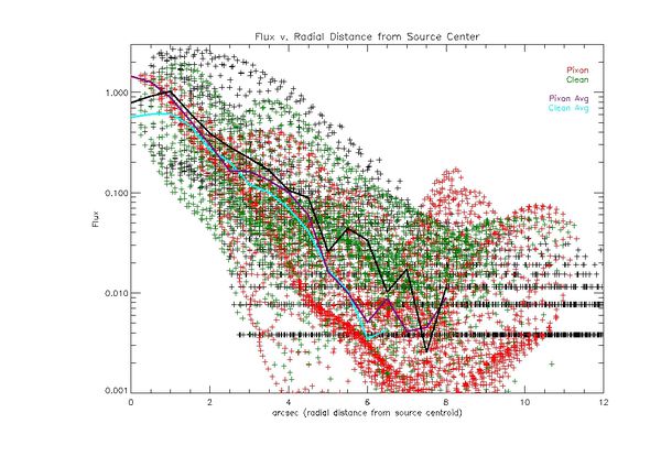
The plot of radial profile shows that the spread of points at any given radial value is larger than for the source closer to disc center in all cases, including the original data map. The pixon profile does show a small bump at ~4 arcsec that may be an albedo contribution. In this case due to the foreshortening I would expect to see a large spread in the flux at the radial distances where the albedo is present. However the spread is large at any radial distance, so it is difficult to see the albedo foreshortening effect.
The plot below shows the clean and pixon contours for an image with approximately 10^5 total counts.
Once again both imaging methods do a better job as the amount of counts increase. The both image the compact source as an ellipse. In this case pixon is still imaging what appears to be foreshortening at the 1% and 3% contours. It is less clear that this is true of clean. The clean contours appear symmetric around the center of the source.
The following plot shows the flux as a function for radial distance from the centroid of the compact source for an image with total counts of approximately 10^5.
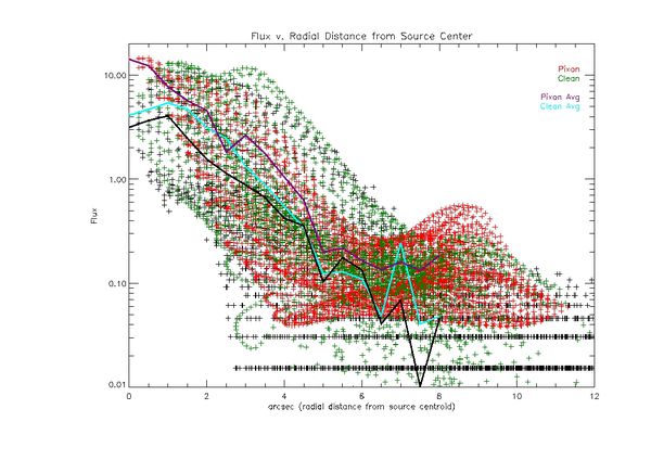
Once again there is a clear bump in the pixon profile for the average value of the flux at approximately the distance we expect to see the albedo. Clean also shows a bump, but the average of the clean points points to the fact that it contains very few points, meaning it may be a statistical anomaly. The pixon algorithm may be imaging the albedo contribution or at least the foreshortening of the albedo contribution.
The plot below shows the clean and pixon contours for an image with approximately 10^6 total counts.
At the highest number of total counts used both algorithms are imaging the elliptical shape of the compact source. However while the clean algorithm has symmetric contours away from the source, pixon clearly shows more flux towards the disc center. This looks like clear evidence of foreshortening.
The following plot shows the flux as a function for radial distance from the centroid of the compact source for an image with total counts of approximately 10^6.
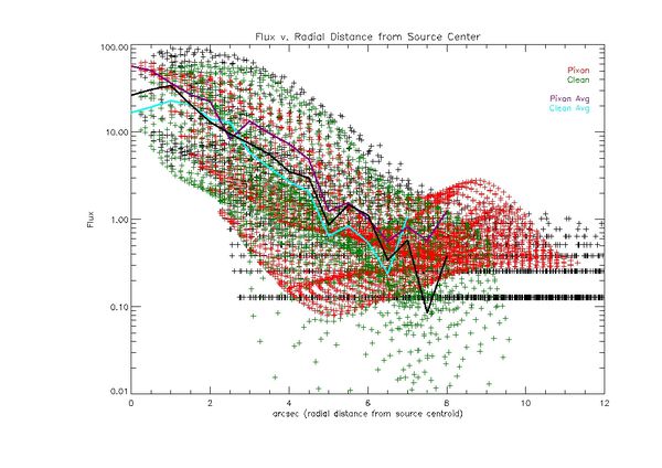
Once again pixon shows a bump where we expect the shoulder to appear due to the albedo and foreshortening effects. Looking at the study near disc center and near the limb, it appears that pixon may not be able to image the albedo directly, but can measure the foreshortening of the albedo.
RHESSI Imaging Algorithm Test - Clean
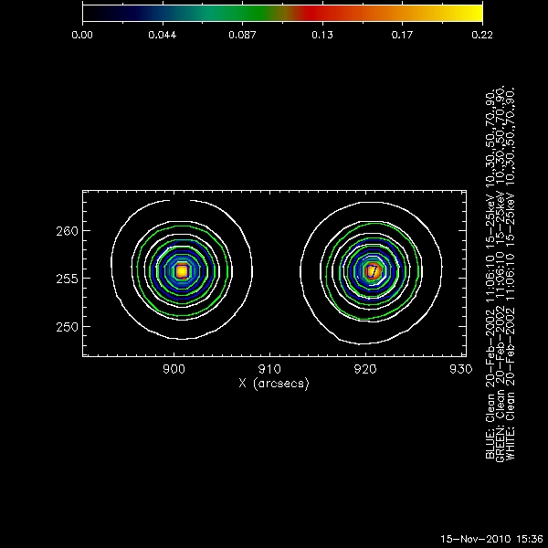
Following the guidelines for the Annapolis algorithm imaging tests, I attempted to make the best possible clean images using the simulated data sets. Below is a representative attempt.
This test was done with a simulated image consisting of two two arcsec sources, 20 arcsecs apart.
The image above shows that clean always get the shape of the circular source and its center correct. The size of the source depends on which detectors are used to make to image. In this case with small compact sources, I will make images using only detector 1, or detectors 1 and 2, to see if the source size is more accurate. Clean can resolve two clearly defined sources, but cannot say anything about the size of the footpoints without some outside knowledge. For instance in this case the size of the footpoints vary greatly depending on which detectors are used to create the image, but the centroids are accurate.
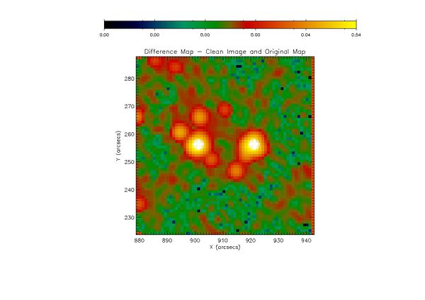
The map below shows the flux difference between the clean image using detectors 1 to 7 and the original data map.
Clean smears the flux out around the original compact source. The areas of largest difference are around the edges of the original source. These differences are about 10% of the peak value of the flux. Once again I'm remaking this map using only the detectors with finer grids to see if it creates a more accurate image.
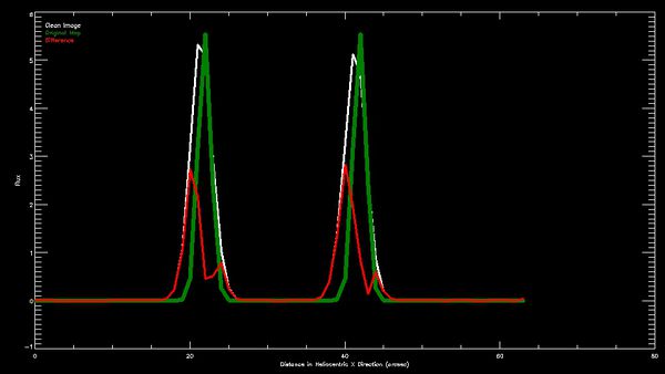
The following shows the flux along a line through the center of the sources in the heliocentric X direction. The white is the clean image, the green is the original data map, and the red is the difference.
This was just a quick test to see if any information could be found since the sources are symmetric about the heliocentric axis through their centers. It shows some offset between the peak of the original data map and the clean image. Is this the smearing from using detectors with coarser grids? If so shouldn't this smearing be symmetric?
The complete sav file of best images so far can be found here
RHESSI Website Migration Update
I've continued adding and editing pages on the site. I started testing ways to remove the html markup from old documents, but have not found anything successful enough for general use as yet. This project will get higher priority this week.
Goals for next week
- Discuss results of albedo imaging tests with Brian, decide on next steps
- Calculate which points are within the 1sigma, 2sigma, and 3sigma, intervals for each radial distance in profile plots
- Check on pixon artifacts at the edge of images. In the cases above pixon consistently shows a higher flux at the edges of images than clean, regardless of total counts
- Continue migrating content to the website, add news module to automatically update nuggets and any other useful information
- Create final version of Annapolis Imaging Test sav file
