Flare Productivity
From RHESSI Wiki
| Nugget | |
|---|---|
| Number: | 190 |
| 1st Author: | Hugh Hudson |
| 2nd Author: | Lyndsay Fletcher |
| Published: | 27 December 2012 |
| Next Nugget: | |
| Previous Nugget: | [1] |
| List all | |
Contents |
Introduction
Solar flares occur seemingly at random, but not really - starting with the solar sunspot cycle itself, and Maunder's butterfly diagram, we have learned that solar activity has a high degree of organization both in space and in time. So, how to track these correlations best? Much of the energy release involved in solar activity (maybe all of it, according to Parker's nanoflare hypothesis). The compactness and brevity of flare energy release could make them an effective tool for characterizing the distribution of this component of coronal heating.
With this in mind, we explore GOES and RHESSI patterns of flare occurrence.
NOAA records
The [GOES] satellites provide a consistent database of flare occurrence via soft X-rays. This database extends almost completely back to 1975, and so we have portions of four solar maxima to work with. The peak energy fluxes of the soft X-ray bursts lead to the traditional classification (by [logarithm], really) into A, B, C, M, and X classes, increasing one decade each step. The less-energetic flares are more numerous, and intrinsically each logarithmic step results in an order of magnitude fewer events. The detectable range extends well below the A level (nanoflares?) but seems to peter out in the decade above X-class.
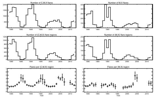
We have taken the event listings and plotted the productivity of the responsible active regions - perhaps nobody had done that before - and show the results in Figure 1. It is instructive to look at the (C,M,X) classes and the major events (M,X only) in the separate panels of this figure. The flare productivity is defined here as just the ratio of number of (M,X)-flares per (M,X)-flaring region, for example. The left panel of the Figure shows that this quantity appears to vary in concert with the solar cycle. This is an obvious artifact, already well known: energetic flares produce long-lasting soft X-ray emission, and this reduces the sensitivity of GOES to weaker flares during that time interval.
The right panel of the Figure, though, has a bit of a surprise. The (M,X) flare productivity normally seems to have hovered around 2 events per region, except during the period 2004-2005 when it roughly doubled. This odd phenomenon just preceded the similarly odd prolonged solar minimum of 2008, and perhaps these oddities are physically linked. If so, the flare occurrence (or the pattern of coronal heating in general) might help to diagnose what is happening inside the Sun where the magnetic activity originates.
Checks and RHESSI
As seen above, the odd variation of flare productivity does not look overwhelmingly significant statistically. But we have checked the detailed histograms of flare productivity per region, and find that the anomaly extends across the entire spectrum.
Furthermore we have checked using the RHESSI flare catalog, which monitors hard X-rays. The hard X-ray data arguably are superior to GOES in some ways. The hard X-rays have shorter durations and larger contrast, and RHESSI measures the centroid location independently of independent data such as H%alpha; flare occurrence, and very precisely too. We have described the catalog, for which we are eternally grateful to Jim McTiernan, in an earlier Nugget. The RHESSI Data show the same pattern in flare productivity, neatly covering the interesting recent maximum and minimum but of course not extending back to 1975.
The RHESSI data also turned up another peculiarity (Figure 2). The plots show flare distribution by Carrington longitude, and broken down by hemisphere (N or S) as well as by cycle (23 or 24). There is a striking variation in hemispheric asymmetry.
Conclusion
We have discussed the statistics of flare productivity, by region, and commented on the possible utility of hard X-ray flare occurrence as an aid to sharpening statistical conclusions about solar activity. Reference [1] has further details. This aspect of the RHESSI data is little-explored at present. Jim McTiernan's existing flare catalog offers an easy way into these data, but we caution the user that a really serious study would involve some further efforts to control the biases that one must find in such a near-real-time catalog.
References
[1] ["Cycle 23 Variation in Solar Flare Productivity"]
| RHESSI Nugget Date | 27 December 2012 + |
| RHESSI Nugget First Author | Hugh Hudson + |
| RHESSI Nugget Index | 190 + |
| RHESSI Nugget Second Author | Lyndsay Fletcher + |

