Weekly Report 19Nov2010 26Nov2010
From RHESSI Wiki
(→RHESSI Image Test - Clean v. Pixon) |
|||
| Line 12: | Line 12: | ||
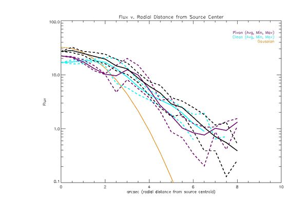
The plot below shows the gaussian model of the compact source (orange),the original data map with the minimum and maximum value at each radial distance (Black), the Pixon image with the minimum and maximum value at each radial distance (Purple), and the clean image with the minimum and maximum value at each radial distance (Cyan)for a source near disk center. | The plot below shows the gaussian model of the compact source (orange),the original data map with the minimum and maximum value at each radial distance (Black), the Pixon image with the minimum and maximum value at each radial distance (Purple), and the clean image with the minimum and maximum value at each radial distance (Cyan)for a source near disk center. | ||
[[File:Flux 301 high avg min max.jpg|center|thumb|600px|Original Data Map (Black), Pixon Map (Purple), Clean Map (Cyan), Model Gaussian (orange) for a source near the disk center]] | [[File:Flux 301 high avg min max.jpg|center|thumb|600px|Original Data Map (Black), Pixon Map (Purple), Clean Map (Cyan), Model Gaussian (orange) for a source near the disk center]] | ||
| - | + | The gaussian model falls off as we would expect the flux to fall in a circular gaussian. For 2 arcsec the model and the map are consistent, after this point the model falls off much more sharply, while the map shows a falloff that is not gaussian. The pixon image shows a tight envelope around the compact source, as does the clean image. As we move into the region where the albedo is present clean falls off in the same manner as the original map. The envelope around the the average of the flux for clean widens immediately after the compact source but then remains relatively constant. The pixon image immediately goes from a tight envelope around the compact source to a wider envolope in the region of the albedo. The size of the envelope remains constant radially but the average moves up and down in an unpredictable manner. For instance at approximately 3.5 arcsec from the peak of the compact source pixon images what appears to be a 'pileup' of flux. At the edges of the image the flux does not drop away to zero but seems to level off. | |
Revision as of 17:31, 24 November 2010
Contents |
Pixon Albedo Imaging
Using Eduard Kontar's simulated eventlist files, Pixon Images were created for a compact circular gaussian source with an albedo contribution near disk center, and near the limb. The following parameters were used for each image:
- Time: 2-Sep-2002 00:07:36 - 00:08:16
- Energy 24keV - 51keV
- Detectors 1 to 4
- Image Size: 64 by 64 pixels
- Pixel Size: .5 arcsec by .5 arcsec
The following plots are extensions of the plots from the previous report.
The plot below shows the gaussian model of the compact source (orange),the original data map with the minimum and maximum value at each radial distance (Black), the Pixon image with the minimum and maximum value at each radial distance (Purple), and the clean image with the minimum and maximum value at each radial distance (Cyan)for a source near disk center.
The gaussian model falls off as we would expect the flux to fall in a circular gaussian. For 2 arcsec the model and the map are consistent, after this point the model falls off much more sharply, while the map shows a falloff that is not gaussian. The pixon image shows a tight envelope around the compact source, as does the clean image. As we move into the region where the albedo is present clean falls off in the same manner as the original map. The envelope around the the average of the flux for clean widens immediately after the compact source but then remains relatively constant. The pixon image immediately goes from a tight envelope around the compact source to a wider envolope in the region of the albedo. The size of the envelope remains constant radially but the average moves up and down in an unpredictable manner. For instance at approximately 3.5 arcsec from the peak of the compact source pixon images what appears to be a 'pileup' of flux. At the edges of the image the flux does not drop away to zero but seems to level off.
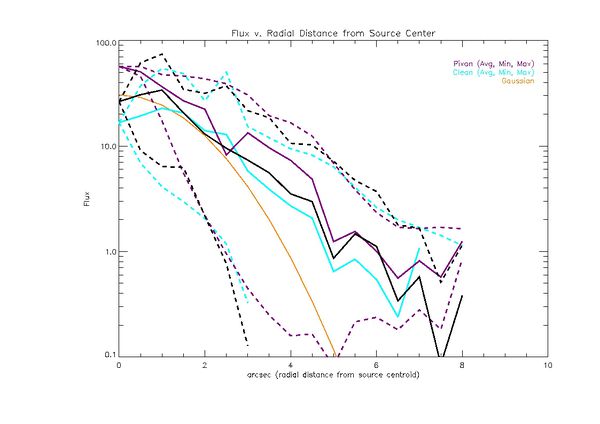
The plot below shows the gaussian model of the compact source (orange),the original data map with the minimum and maximum value at each radial distance (Black), the Pixon image with the minimum and maximum value at each radial distance (Purple), and the clean image with the minimum and maximum value at each radial distance (Cyan) for a source near the limb.
