High-energy Electrons and Electric Currents during a Flare
From RHESSI Wiki
| Nugget | |
|---|---|
| Number: | 255 |
| 1st Author: | Sophie Musset, |
| 2nd Author: | Nicole Vilmer and Véronique Bommier |
| Published: | 22 June 2015 |
| Next Nugget: | The Fastest Flare |
| Previous Nugget: | The stars of the Kepler superflares |
| List all | |
Contents |
Introduction
Energy release during solar flares is likely to occur in the solar corona, where energy can be stored magnetically. In a well-accepted scenario, the gradual buildup of energy in the corona involves the development of current sheets. These current sheets can be traced by their footprints (current ribbons measured at the photospheric level). What is the relation between the locations of these photospheric current ribbons and the X-ray sources tracing the energetic electrons during solar flares? These electrons involve a major fraction of the total flare energy, it turns out. Nowadays, the combination of continuous polarimetric measurements with SDO/HMI and hard X-ray observations with RHESSI allows us to compare high quality vector magnetic field (and electric current density) maps and HXR observations of solar flares at the same time.
We have studied the relation between photospheric current densities and X-ray emission and their simultaneous evolution for the GOES X2.2 flare SOL2011-02-15 (Ref. [1]).
The X-ray Flare
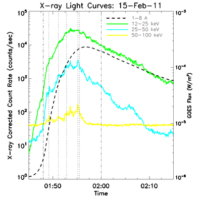
This major flare is appropriate for this kind of study since it happened near the disk center, which allows good measurements of the vector magnetic field and reduces the projection effects. As the vector magnetic field is only measured at only one layer of the solar atmosphere, we can only infer the vertical component of the electric current flow. The RHESSI corrected count rates and the X-ray flux from GOES for the flare are presented in Figure 1.

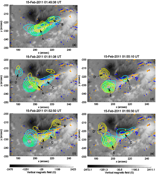
Images were reconstructed with the CLEAN algorithm using detectors 2 to 9, at times shown by the vertical dotted lines in Figure 1, which correspond to peaks in the high energy emission (> 25 keV).
The photospheric magnetic field and vertical current-density maps
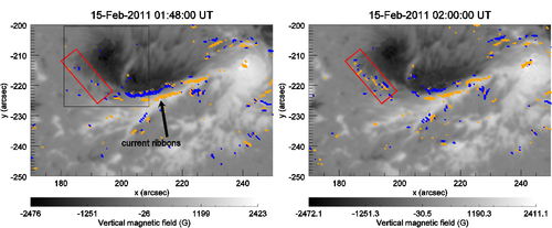
Spectropolarimetric data from SDO/HMI allow the calculation of the full 3D vector magnetic field at the photospheric level. A map obtained in this way for active region 11158 at 01:48 UT is shown in Figure 2 (left). Then the vertical current density at the photospheric level is calculated from the curl of the magnetic field. The corresponding map is shown in Figure 2 (right).

HMI produces a set of vector magnetic data every 12 minutes, and we thus can watch for changes on that time scale. The maps closest in time to the peak of the X-ray flare are at 01:48:00 and 02:00:00 UT (see dashed-dotted vertical lines in Figure 1). We are particularly interested in changes of the vertical current flow.

The two magnetic maps at 01:48 and 02:00 are shown in figure 3. The current ribbons are clearly visible (the long and narrow current density structures between the two central magnetic polarities of the active region). These current ribbons are most likely the photospheric footprints of a coronal current sheet where magnetic reconnection can occur.
The vertical magnetic field does not show a significant evolution between these two maps, however, the vertical current density is evolving during the 12-minute gap between the two maps. In particular, the current density increases by 15% in the region marked by the red box in Figure 3.
Hard X-ray-emitting electrons and photospheric currents
Figure 4 shows the evolution of hard X-ray sources with time, overlaid on the vertical magnetic field and current density maps at the photospheric level obtained at 01:48 UT (left) and 02:00 UT (right).

The X-ray sources are evolving during the flare and their structure is quite complex. The 50-100 keV source labelled A in intervals (a), (b) and (c) is most likely to be a coronal X-ray source. The 50-100 keV sourced labelled D’ and E in intervals (d) and (e) are the footpoints of a loop.
Two main results can be drawn from the superposition of X-ray emissions sites on the magnetic maps:
1. The part of the X-ray emission produced in an extended coronal source in intervals (a), (b) and (c) overlies the current ribbons observed at the photospheric level;
2. The new X-ray source D’ appearing at 50-100 keV in intervals (d) and (e) is located in the region where new vertical photospheric electric currents appeared between 01:48 and 02:00 UT. This observation shows a a clear link between particle acceleration and the current ribbons, which trace reconnecting current sheets.
These two results can be qualitatively explained in the an earier Nugget, where magnetic reconnection is most likely to occur on current sheets in the corona. Since X-ray emissions are the signatures of particle acceleration and since photospheric currents trace the footprints of coronal current sheets, spatial and temporal correlation between these X-ray emitting sites and photospheric current ribbons can be expected. In addition, the evolution of magnetic reconnection sites on the course of the flare may lead to two linked consequence: the apparition of new sites of hard X-ray emissions and a change in the magnetic topology leading to an increase of the vertical current density at the photospheric level.
Conclusion
These observations show a spatial correlation between photospheric current ribbons and coronal X-ray sources. Moreover, for the first time, a conjoint evolution of hard X-ray emission and vertical current density at the photospheric level is observed during the course of a flare, and explained as the double consequence of the propagation of reconnection sites in the corona.
References
[1] "Hard X-ray emitting energetic electrons and photospheric electric currents"
| RHESSI Nugget Date | 22 June 2015 + |
| RHESSI Nugget First Author | Sophie Musset, + |
| RHESSI Nugget Index | 255 + |
| RHESSI Nugget Second Author | Nicole Vilmer and Véronique Bommier + |